- “Jazz demands that you become an individual.”
- “We should’ve known recycling was a scam when they made the bins out of plastic.”
- “Nevermind the moon, let’s get some of that cash in Harlem.”
- “Abracadabra means “I create as I speak” in Hebrew.”
- Being too comfortable makes you less curious. Being less curious makes you less creative. Succeed with caution.
- “Theres a difference between you can earn everything that is earnable and you deserve everything there is.”
- The best way I can describe blackness is to imagine a world without it.
- “These days, no one is bending down to pick up a dollar.”
- “Just cause they give you shit don’t mean you have to take it.”
- “Your reaction to having nothing is to become quite decadent.”
- Your own government is living check to check.
- “Before it was called the art world and now it’s called the art market, and that’s the difference between then and now.”
mute
unmute
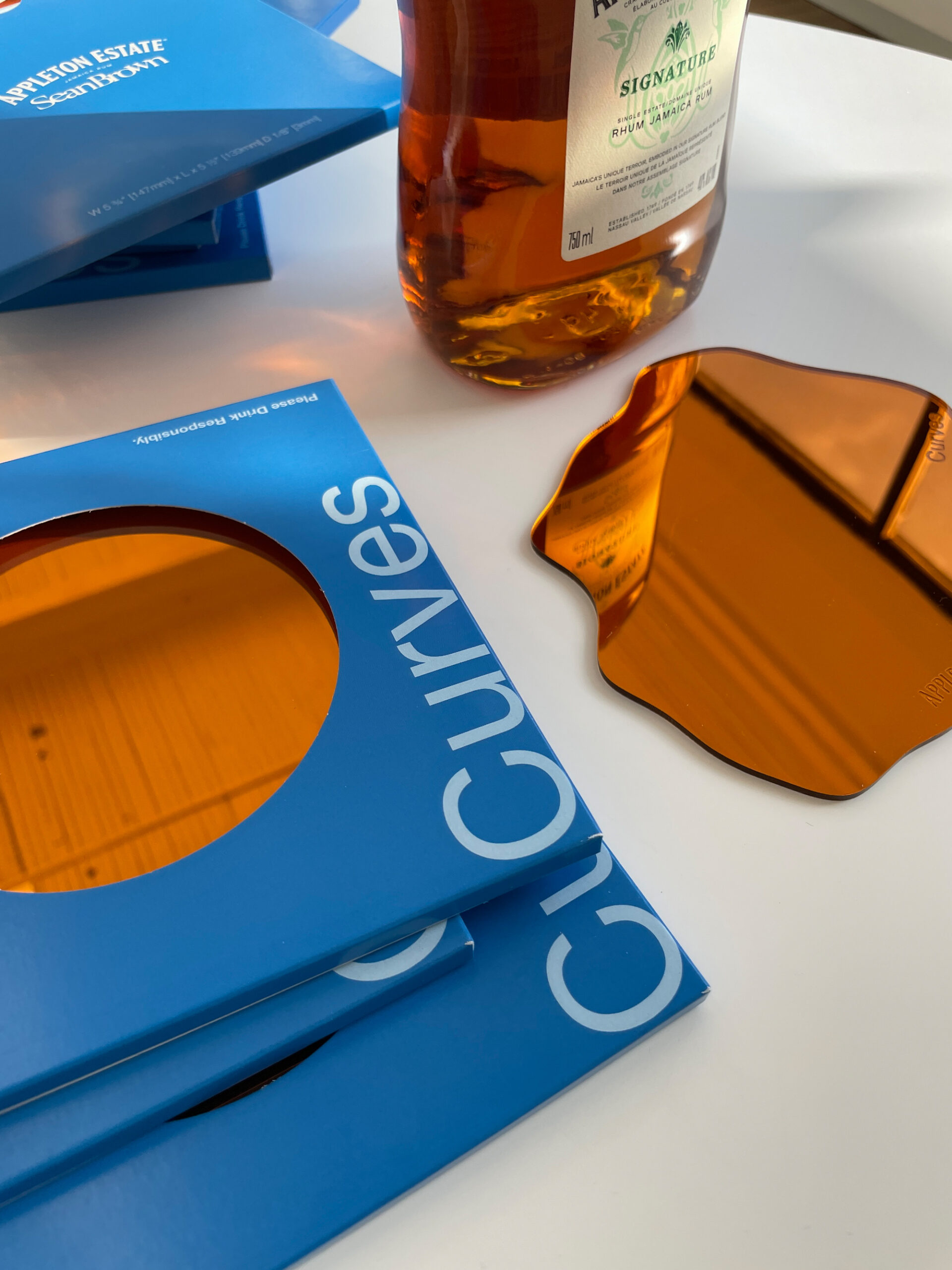


This is the mobile rum bar designed (with Canan Iscan) for Appleton Estate. Our approach was to fuse industrial and natural elements into the design but still keeping it very Jamaican and very elevated. Sorta like the energy in a Beth Lesser photo, a Stone Love party poster, or the Trident Hotel. But the real goal was to modernize the road side bar you’d see driving through Lucea and embed it in a big city. Oh, and you get a set of limited edition Curves rum coasters at the tasting. Visualizations by Nick Callies.

I saw this water fountain in Switzerland and thought about how simple yet forward thinking urban design can and should be. I feel like this type of thing is so overlooked in North America.

The Cru Wine Rack by Dennis Lin for Umbra (2007). So fire. I have it in black.


The Mr. Impossible by Philippe Starck for Kartell “stems from the—apparently impossible—idea of joining two oval bodies without using glue, to obtain an indissoluble weld.” That’s the fancy way of saying “with laser technology”. These were first presented in Milan in 2007, and brought to market in 2008. A couple months ago I found someone on Facebook Marketplace with a set of four in mint condition. We had them in our office the next day.


This is the front and back cover design I did for Normani’s ‘fair’ coming out literally in a few hours. Blair Caldwell did the photography, and because his work feels the past and future at the same time I had an easier place to start.
It’s fair to assume (lol) that as we entered into a more digitized way of consuming music, elements of physical packaging would become obsolete. That doesn’t mean accreditation through design should become a lost art. If it wasn’t for liner notes included with my favourite albums growing up I wouldn’t have been able to connect work to a name, and I probably wouldn’t even be typing this to you right now, so that’s a good enough reason to keep the idea of a back cover alive.


The last time I worked with New West, (a band from Toronto that sound like if Elton John, Mazzy Star and Oasis happened to book the same studio session) I directed a short film for their debut EP. They’re about to drop a follow up to the (2019) on April 4th and this time I envisioned a concept where the project comes with a photo book to look through while listening.
I know where in a content heavy space where reels and loops are replacing still image, but I do think things are slowly going back to the ideas of tangible media. And when you think about it, whats an engaging way to pair audio visual together physically in the digital age? My thought is to bring things back to basics with a literal photo album. Listen to their previous releases here.


Title card designed for Keem & Kendrick’s fam ties. The yellow tone I used for these titles I sampled from the titles in Touch The Sky. Dave Free wanted something that felt like cinema, which made me think Wong Kar Wai and Tarantino. Watch it here if you haven’t already.

This playlist was made for RSVP Gallery last year when they started stocking Curves. Sharing it here because I still listen to these songs regularly. That song from Will.I.Am’s debut solo album is wildly slept on, plus I have a new appreciation for Felix da Housecat since learning more about the inception of Chicago house.

We’re launching an interior design magazine this Spring. I’m not sure I’ve said the name somewhere online already but the premise is this:
We wanted to see design and spaces that we wanted to occupy. We wanted to discover and share stories from people like us (you) included. We want to encourage more creatives to take up space in home décor and design to shift the conversation around what it does for creativity, inspiration and an overall mental wellbeing.
There are a few more stories left to shoot and then its off to the presses. I’ll be loud about it once its done.
“Ain’t nobody’s hero, but I wanna be heard / On your Hot 9-7 every day, that’s my word.”

We renovated the Curves homepage with some needed subtractions and necessary additions. One big feature we added was a catalogue archive. You can browse the most recent and previous Curves catalogues online here.

This modular Curves shelving is ready to go conceptually, but still sorting some logistical stuff. I think the Archway shelving we got on the way will drop long before this but this is still going to market at some point.


The ‘Trunk Lamp’ I designed for RIMOWA using their raw luggage materials, apart of the ongoing ‘As Seen By’ exhibition. This was on display during Art Basel last year and currently on its own world tour. I think its headed to Hong Kong next but I’ll let you know. I’ve been meaning to make a smaller version for myself too I gotta get on that.

Full Marni for this SSENSE interview. Those have literally become my house slippers now. Words by Sumiko Wilson, photography by Brendan George Ko. Read the full story here.

I wrote an essay on the best of Hype Williams (to me) in no particular order for HotNewHipHop. Just to be clear, there isn’t enough bandwidth on the internet to break down Hype’s genius, but I made a case for each video I picked. Read it here.
Reactionary taste,
the enemy of art.

During the holidays we ended up designing an entire Archway by Curves collection. Very extensive collection for the home including lamps, room dividers, coffee tables and a very very important object I’ll share here once the prototype is done. Until then, our Archway chairs are available at SSENSE.
I just want to point out that this is almost 25 years ago. If you notice at the beginning the caption reads that its set in the year 2012, Busta’s predicted ‘extinction level event’ but this still feels like a music video filmed another 5o years from now. I remember buying this single on CD. Paul Hunter, you’re wild for this.

For the record (pun intended) I’ve really started to appreciate Vol. 3 a lot more. Maybe even I have the rug to thank for that hah. But nah, my favourite Jay album is still the Blueprint, its just that Grey is a more neutral tone for the home, imo.

This is gonna be bite sized explanations of the process, because if I start getting too long winded I won’t find or have the time. A digital scrapbook of inspo, isms, previous work, and work in progress. The reward for good work is more work according to Jonas Salk.